Athina Karpathiotaki, Multi-Disciplinary Designer

Drag to explore · Tap a project

Turning complex ideas
into simple things
people keep.

Currently Senior Brand & Product Designer at REBORRN
Studied Graphic Design, Visual Communication & Strategic Product Design

Brand Design

  • Identity Systems
  • Art Direction
  • Packaging
  • Campaigns
  • Editorial

Product Design

  • Physical Products
  • Product Blueprints
  • Feature Logic
  • Printing & Production

Digital Design

  • UX/UI Design
  • Native & Web Apps
  • Design Systems
  • Websites

Clients

  • Coca-Cola
  • Philip Morris International
  • Vans, VF Corporation
  • L’Oréal
  • MOIA, Volkswagen Group
  • Avin, Motor Oil Group
  • Plaisio
  • Box Now

Path

  • REBORRN, since 2023
  • Twenty Rising, Berlin, 2024–2025
  • Independent, since 2016
  • Relevance, 2021–2023
  • COMMA, 2021
  • Art in Your Hand, 2018–2021
  • Rockin’Athens, 2014–2017
Ch. One

Less

I start by taking things away. Before a logo, a screen or an object takes shape, I ask what it can live without. The answer is usually more than expected, and what remains gets stronger.

Dieter Rams called it less, but better. It is still the most useful brief I know. Fewer elements leave room for the one idea that matters, and give people less to decode and more to feel.
Ch. Two

Clarity

Brand, product and software are one conversation. The identity sets the tone, the product keeps the promise and the interface makes it easy to live with. When one speaks another language, people notice.

So I work across all three. More than ten years with names like Coca-Cola, Philip Morris, Vans and L’Oréal taught me how systems hold at scale. The same discipline makes a small brand look like it was always there.

Ch. Three

Growth

Some of my favourite projects begin with a founder, a name and a feeling. Startups and small teams like Hoper decide with conviction, and the work grows with them from 0 to 1: from the first sketch to the shelf and the screen.

I like being there for that. A good identity should still fit when the company is five times bigger. And sometimes growth is simply play: with friends, I pour candles that keep memories in a can.

Ch. Four

Craft

The difference lives in the details: the spacing that feels right, the curve of a letter, the weight of a box in the hand, the state of a button nobody notices. Those decisions make a thing feel finished.

I keep refining until nothing feels accidental. Not to make the work louder, but quieter and surer of itself, so it simply works and keeps working long after launch.

Ch. FiveSide Story

Fortune Candles,
memories in a can.

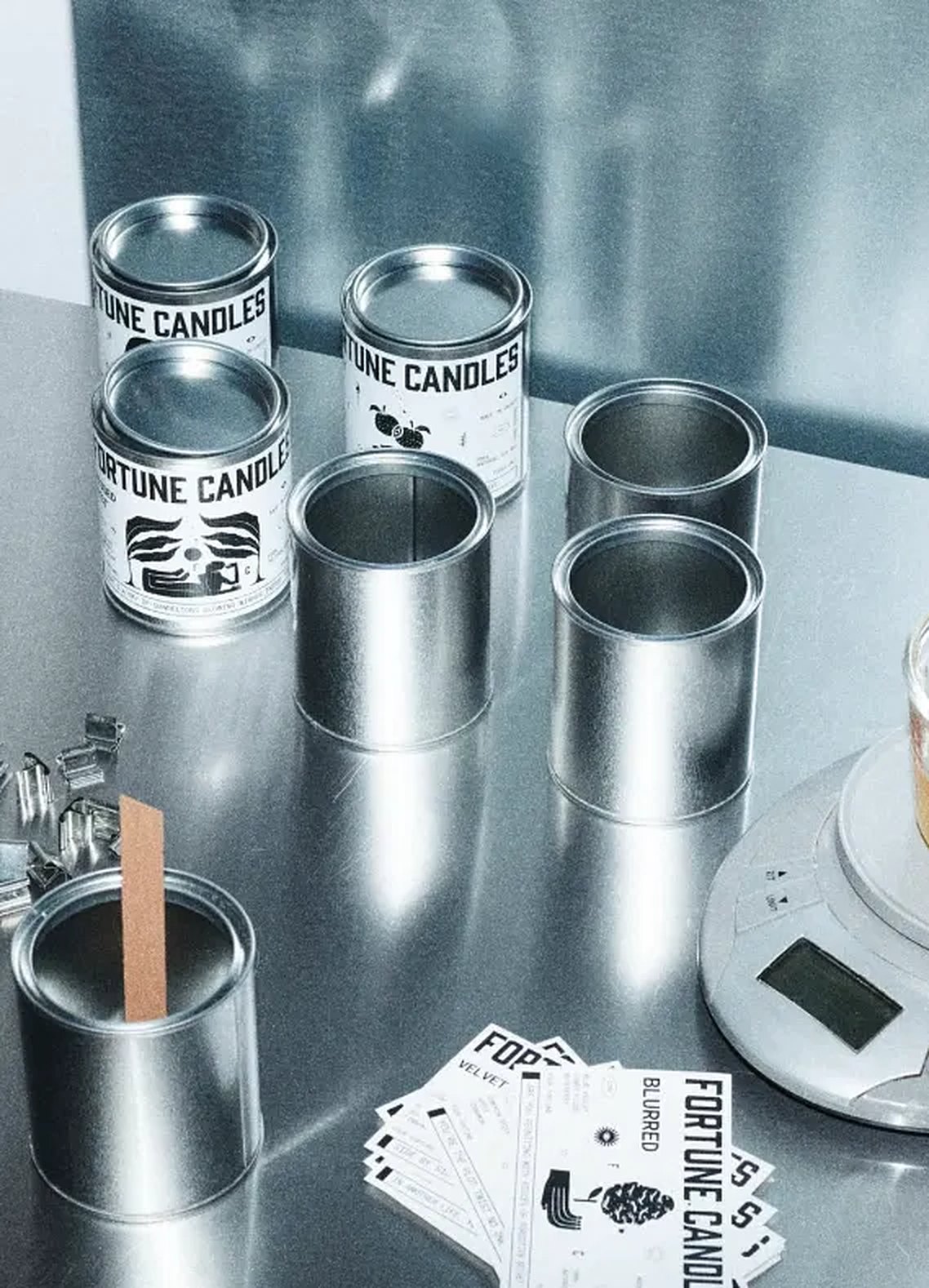
It started between friends, at a steel worktop. We pour wax into plain tin cans, weigh every batch by hand and let each scent hold a small story of its own.

Fortune CandlesInstagram Fortune Candles tins and printed labels on a steel worktop, with wax melting on a kitchen scale Crafting memories in a canView post ↗

Between pours, design does its quiet work: the labels, the type, the small ritual of opening a tin. Each can is sealed like a keepsake, so a moment can be lit again whenever it is needed.

Ch. SixTogether

Have something in mind?
Let’s bring it to life, together.

Write an emailAthens, --:--

Athina Karpathiotaki ©2026 All Rights Reserved